
Before diving into the details, this guide provides a comprehensive overview of digital marketing attribution models—from simple single‑touch frameworks like first‑ and last‑touch, through multi‑touch approaches such as linear, time‑decay, and position‑based, to advanced data‑driven and algorithmic methods using Markov chains and Shapley values. You’ll learn the strengths and limitations of each model, discover how to select the best fit for your sales cycle and analytics maturity, and explore practical tools and best practices for implementation. By the end, you’ll be equipped to optimize budget allocation, improve ROI, and align marketing efforts with business goals.
What Is Attribution Modeling?
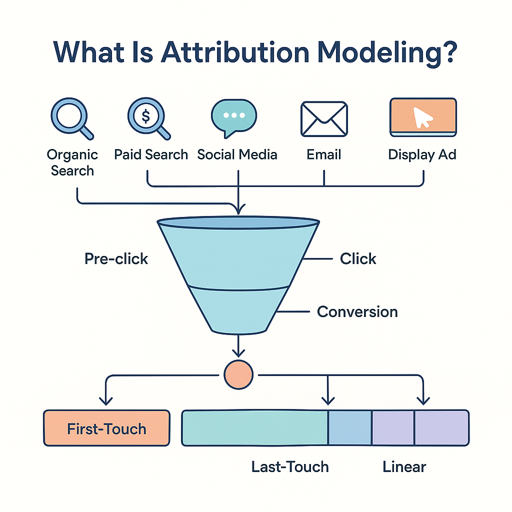
Attribution modeling is a framework that determines how credit for conversions is assigned to different marketing touchpoints in a customer’s journey. At its core, it answers the question: “Which channel or campaign generated this user, lead, or sale?” . Traditional models like last‑click are simple but overlook the influence of earlier interactions, necessitating more nuanced frameworks to capture the full customer journey.
Single‑Touch Attribution Models: Pros and Cons

Single‑touch attribution models assign 100% of the conversion credit to one touchpoint—either the first or the last interaction. While easy to implement, they provide a limited view of a multi‑step decision process.
First‑Touch Attribution
First‑touch (or first‑click) gives all credit to the initial interaction, making it useful for understanding channels that drive awareness. It’s straightforward and highlights top‑of‑funnel drivers but ignores all subsequent nurturing activities.
Last‑Touch Attribution
Last‑touch (or last‑click) allocates all credit to the final interaction before conversion, offering clear visibility into which channel sealed the deal.
Pros:
-Simplicity and ease of understanding
-Immediate insights into high‑impact, lower‑funnel channels
Cons:
-Ignores earlier assisting channels that build awareness and consideration
-Biased toward last‑click channels (e.g., paid search, direct)
Multi‑Touch Attribution Models: Linear, Time Decay, and Position‑Based

Multi‑touch attribution distributes credit across several interactions, reflecting the collaborative nature of modern marketing channels.
Linear Attribution Model
The linear attribution model splits conversion credit equally among all touchpoints in the customer journey, offering a balanced view of each interaction’s role.
Advantages:
-Acknowledges every touchpoint’s contribution
-Simple to implement and understand
Disadvantages:
-Fails to differentiate between more and less influential interactions
-May dilute credit for high‑impact touchpoints (e.g., demo requests)
Time Decay Attribution Model
Time decay attribution assigns more credit to touchpoints closer in time to the conversion, based on the principle that recent interactions have greater influence.
How It Works:
-Touchpoints receive weights that decrease exponentially the further they are from the conversion event.
Benefits:
-Balances acknowledgment of all touchpoints with emphasis on late‑stage interactions.
-Ideal for businesses with longer, non‑linear customer journeys.
Limitations:
-Can undervalue early awareness‑building activities.
-Requires careful configuration of decay parameters (e.g., half‑life)
Position‑Based (U‑Shaped/W‑Shaped) Attribution
Position‑based models—often called U‑shaped—allocate the majority of credit (e.g., 40%) to the first and last touchpoints, with the remaining credit distributed equally among middle interactions. This approach highlights both awareness and conversion drivers while still acknowledging mid‑funnel efforts.
Data‑Driven and Algorithmic Attribution

Data‑driven attribution leverages statistical and machine‑learning techniques to assign credit based on observed contribution to conversions.
–Markov Chains: Use probabilistic modeling of conversion paths, analyzing transitions between touchpoints to estimate each channel’s impact. Models simulate both converting and non‑converting user journeys for calibration.
–Shapley Value Attribution: Originating from cooperative game theory, Shapley values fairly distribute conversion credit among channels by considering all possible touchpoint sequences and their marginal contributions. While highly accurate and equitable, Shapley models can be computationally intensive and data‑heavy.
How to Choose the Right Attribution Models for Your Business
Selecting an attribution model depends on factors like sales cycle length, analytics maturity, data availability, and budget. Consider:
–Sales Cycle Complexity: Use time decay or algorithmic models for longer, multi‑touch journeys.
–Data Volume: Data‑driven models require extensive, clean datasets.
–Analytics Resources: Probabilistic and Shapley models need technical expertise and computing power.
–Business Objectives: For quick, actionable insights, start with last‑click; for balanced awareness‑to‑conversion views, try position‑based; for precision, deploy data‑driven models.
Implementing Attribution Models: Tools and Best Practices
Tools:
–Google Analytics 4 (GA4): Offers first, last, linear, and data‑driven attribution; integrates seamlessly with Google Ads.
–Adobe Analytics: Provides rule‑based and AI‑driven models; suited for enterprise needs.
–Mixpanel: Tracks customer journeys and attributes traffic sources automatically.
–Adjust.com: Specializes in mobile app attribution with deterministic and probabilistic methods for clicks and impressions.
Best Practices:
1. Tag Governance: Establish clear policies, naming conventions, and regular audits to maintain data quality and compliance.
2. Lookback Windows: Align attribution windows (e.g., 7‑day click, 1‑day view) with customer behavior and campaign goals.
3. Data Layer Standardization: Ensure consistent data collection across platforms to feed multi‑touch and algorithmic models effectively.
4. Cross‑Channel Integration: Consolidate data from paid, organic, email, and offline channels for a holistic view.
5. Continuous Optimization: Regularly compare model outputs, run split‑tests, and refine parameters to reflect evolving customer behavior.
Frequently Asked Questions
1. Which attribution model should I start with?
Begin with last‑click for simplicity, then experiment with linear or time‑decay to understand multi‑touch impacts.
2. How do data‑driven attribution models work?
They use machine‑learning or probabilistic techniques (e.g., Markov chains, Shapley values) to analyze converting and non‑converting paths, assigning credit based on statistical contribution.
3. Can I use multiple models simultaneously?
Yes—split‑testing different models side‑by‑side helps compare performance, and many platforms allow model‑comparison dashboards for real‑time insights.
4. How does lookback window affect my attribution?
Shorter windows emphasize recent interactions, while longer windows capture early touchpoints; choose based on your product’s purchase cycle (e.g., B2B vs. B2C)
5. What tools support advanced attribution modeling?
Google Analytics 4, Adobe Analytics, Funnel.io, Statsig, Adjust.com, and specialized solutions like Usermaven or Ruler Analytics offer advanced multi‑touch and data‑driven capabilities
At Balistro, we specialize in helping businesses grow through effective digital marketing strategies. From Google Ads to Meta Ads, we deliver data-driven campaigns that maximize your ROI and drive real results. If you’re looking to boost your online presence, generate leads, or scale your e-commerce business, our expert team is here to help. Contact us today to learn more about how we can support your advertising needs!
Ready to Grow Your Business?
Book a free 30-minute strategy call with Balistro. We’ll audit your marketing and show you exactly where your biggest growth opportunities are.
Why Data Analytics Is the Foundation of Marketing Success
In an era where companies that adopt data-driven marketing are 23x more likely to acquire customers (Source: McKinsey), data analytics has become the competitive differentiator between brands that grow and brands that guess. For Indian businesses investing in digital marketing, analytics transforms ad spend from a cost center into a precision growth engine.
The transition to GA4 and the evolution of marketing attribution have created both challenges and opportunities. Brands that invest in proper analytics infrastructure — comprehensive tracking, custom dashboards, and multi-touch attribution — make better decisions faster. Organizations using real-time dashboards make decisions 5x faster than those relying on manual reports (Source: Domo).
Beyond measurement, modern analytics enables predictive marketing — using historical data to forecast future performance, identify high-value customer segments, and optimize budget allocation before spending a single rupee. This proactive approach to marketing optimization is what separates market leaders from followers.
Setting Up a Marketing Analytics System That Drives Decisions
- GA4 Configuration & Event Tracking: Implement GA4 with comprehensive event tracking — page views, scroll depth, button clicks, form submissions, and e-commerce events (view item, add to cart, purchase). Configure enhanced measurement and set up custom events for business-specific interactions.
- Conversion Tracking Across Platforms: Install tracking pixels for all advertising platforms (Google Ads, Meta Pixel, LinkedIn Insight Tag). Implement server-side tracking via Google Tag Manager Server Side or platform-specific APIs for more accurate attribution, especially given iOS privacy changes.
- Custom Dashboard Creation: Build dashboards in Google Looker Studio that connect to all your data sources — GA4, Google Ads, Meta Ads, CRM, and e-commerce platforms. Create views for different stakeholders: executive overview (KPIs and trends), marketing team (campaign performance), and finance (ROI and budget tracking).
- Attribution Modeling: Move beyond last-click attribution to data-driven or multi-touch models. Understand the contribution of each touchpoint in the customer journey. Use attribution insights to allocate budget to channels that truly drive conversions, not just those that happen to be the last click.
- Reporting Cadence & Action Framework: Establish a reporting rhythm: daily performance checks, weekly optimization meetings, monthly strategic reviews, and quarterly business reviews. Every report should include not just data, but actionable recommendations based on the insights.
Data Analytics Mistakes That Lead to Bad Marketing Decisions
- Tracking too many metrics: Dashboard overload leads to analysis paralysis. Focus on 5-7 core KPIs that directly tie to business objectives. Everything else is supporting detail, not a primary decision metric.
- Relying solely on last-click attribution: Last-click attribution overvalues bottom-funnel channels and undervalues awareness and consideration touchpoints. This leads to underinvestment in top-of-funnel campaigns that actually drive growth.
- Not validating data accuracy: Garbage in, garbage out. Regularly audit your tracking setup — check that conversion events fire correctly, tag implementations are consistent, and data sources align. Inaccurate data leads to confidently wrong decisions.
- Making decisions on insufficient data: Statistical significance matters. Don’t optimize based on small sample sizes or short time periods. Most campaign optimizations need at least 100 conversions and 2-4 weeks of data to be reliable.
- Ignoring qualitative data: Numbers tell you what happened; qualitative data tells you why. Combine analytics with customer feedback, surveys, heatmaps, and session recordings for a complete picture of user behavior and motivation.
Frequently Asked Questions
What is the difference between GA4 and Universal Analytics?
GA4 uses an event-based data model where every interaction is an event, while Universal Analytics used a session-based model with pageviews, events, and transactions as separate hit types. GA4 offers cross-platform tracking, machine learning-powered insights, and privacy-centric measurement. Since Universal Analytics was discontinued, GA4 is now the standard for web analytics.
How do I choose the right marketing attribution model?
The best attribution model depends on your business. Data-driven attribution (available in GA4 and Google Ads) is generally recommended as it uses machine learning to assign credit based on actual conversion paths. For businesses with shorter sales cycles, position-based attribution works well. Longer B2B sales cycles benefit from linear or time-decay models that credit multiple touchpoints.
What should a marketing dashboard include?
An effective marketing dashboard should include: traffic overview (sessions, users, sources), conversion metrics (conversion rate, revenue, leads), advertising performance (spend, ROAS, CPA), channel comparison, and trend analysis. Include both real-time data for daily monitoring and historical trends for strategic planning. Balistro builds custom Looker Studio dashboards tailored to each client’s specific KPIs.
Ready to Grow Your Business?
At Balistro Consultancy, we help D2C and B2B brands achieve measurable marketing results through data-driven strategies. Whether you need Google Ads management, Facebook advertising, SEO services, or email marketing, our team of certified specialists is ready to help you grow.
Book a free consultation call to discuss your marketing goals and discover how Balistro can drive real results for your brand.
Transforming Marketing Data into Competitive Advantage
The most successful marketing organizations treat data analytics not as a reporting function but as a strategic discipline that informs every marketing decision. Building a data-driven marketing culture requires investment in tools, processes, and talent — but the payoff in improved marketing efficiency and effectiveness is substantial.
GA4’s event-based data model offers significantly more flexibility than Universal Analytics for tracking complex user journeys. Custom events, user properties, and audiences enable granular analysis of how users interact with your website and marketing campaigns. Implementing comprehensive GA4 tracking from the start saves significant time and effort compared to retrofitting tracking later.
Marketing mix modeling (MMM) has experienced a renaissance as brands seek holistic views of marketing performance beyond digital attribution. By analyzing the relationship between marketing spend and business outcomes across all channels — including offline — MMM provides strategic-level insights about optimal budget allocation that last-click attribution simply cannot offer.
Real-time dashboards transform how marketing teams operate by replacing weekly or monthly reporting cycles with continuous performance monitoring. Google Looker Studio dashboards connected to live data sources enable marketers to identify opportunities and issues in real-time, dramatically reducing the time between insight and action.
Predictive analytics powered by machine learning is becoming accessible to marketing teams of all sizes. Tools built on GA4’s predictive audiences, Klaviyo’s predictive analytics, and custom machine learning models can forecast customer lifetime value, churn probability, and conversion likelihood — enabling proactive marketing decisions rather than reactive ones.
